
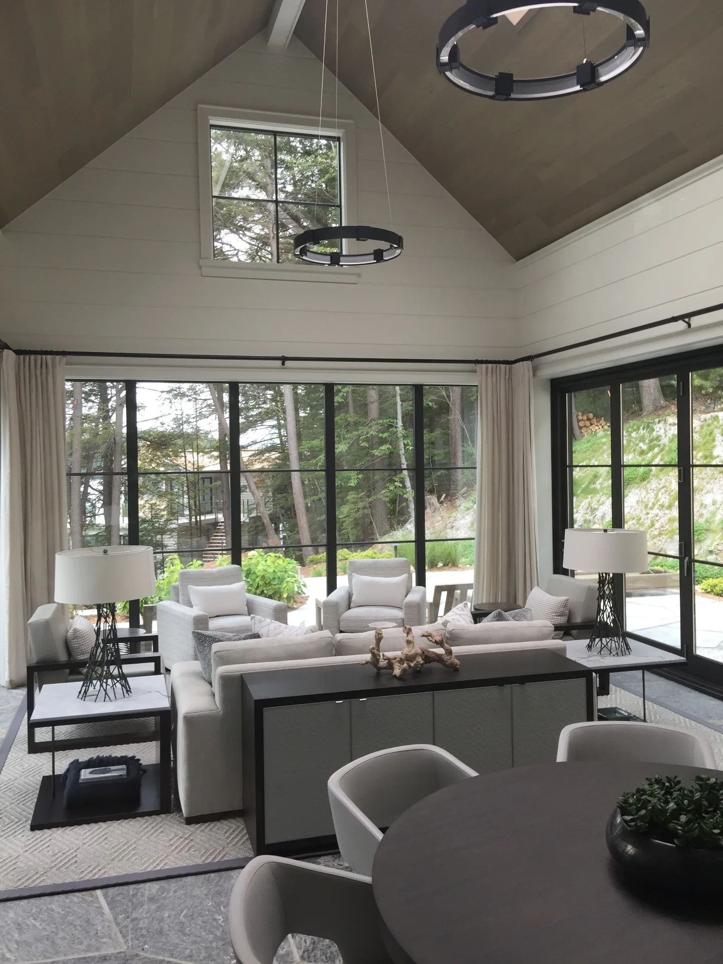
What Are the Best Interior Paint Colours for a Muskoka Cottage?
It's one of the most common questions we get asked — and one of the most interesting to answer. Because the right interior colour for a Muskoka cottage isn't just about what looks good in a magazine. It's about what holds up in a space shaped by pine ceilings, stone fireplaces, lake light, and a building that may have been closed for six months.
Cottage interiors have their own rules. The light is different. The materials are different. And the people using the space want to feel something different than they do in their Forest Hill or Rosedale home — something slower, more grounded, more connected to the landscape just outside the window.
Here's how to approach colour selection on a Muskoka property — and why the answers are more nuanced than any online colour quiz will tell you.
Why Muskoka Light Changes Everything
Before you pick a colour, you need to understand your light. And in Muskoka, light is rarely simple.
A north-facing cottage on Lake Rosseau receives cool, blue-toned light through most of the day. Any colour you apply will read cooler and slightly greyer than it does on a test swatch. A south-facing great room in Dwight or Bala gets warm, golden afternoon light that transforms even a quiet neutral into something rich and glowing. An east-facing bedroom catches brilliant morning light that fades to shadow by afternoon.
What this means practically: a warm white that looks stunning in a sun-drenched Port Carling showroom may read flat and chalky in your shaded Lake of Bays screened porch. A cool grey that felt sophisticated in a Toronto condo can turn visibly blue-green on a north wall surrounded by cedar. Always test in your actual space, in natural light, at multiple times of day — before committing to a litre of paint, let alone twenty.
The Three Palette Families That Work in Muskoka
There is no single right answer for Muskoka interiors. But there are three colour families we see perform consistently well across different cottage types, orientations, and design sensibilities.
Muskoka-inspired naturals are the most versatile starting point. These are the warm neutrals — creamy whites, soft taupes, earthy greiges, and muted sage greens — that echo the landscape directly outside the window. Benjamin Moore's White Dove OC-17 remains one of the most reliable cottage whites in Canada: warm enough to feel inviting, clean enough to let wood and stone breathe. Pale Oak OC-20 is another consistent performer on pine-heavy walls where you want warmth without yellow. For cottages wanting to lean into the forest and rock palette, muted sage and soft olive greens — think Salisbury Green HC-139 or October Mist 1495 — feel entirely at home surrounded by Muskoka's tree canopy. These palettes age beautifully, photograph well, and rarely compete with the natural materials already doing the heavy lifting in most cottages.
Coastal and washed whites are increasingly popular with clients renovating older cottages on Lake Joseph and Lake Rosseau, where the goal is a brighter, more elevated feel without losing the warmth of a traditional cottage. These aren't stark, cold whites — they're layered, slightly complex whites with greige or linen undertones that catch light beautifully and make dark-beamed rooms feel airy rather than heavy. Benjamin Moore's Chantilly Lace OC-65 is technically a pure white but reads softer than it sounds. Cloud Cover OC-25 and Simply White OC-17 both perform well in open-concept spaces where you want the ceiling, walls, and trim to feel cohesive rather than chopped up.
Moody, dark interiors have moved decisively from trend to permanent fixture in high-end Muskoka renovations. Deep forest greens, inky charcoals, warm near-blacks, and saturated navy blues are showing up in dining rooms, primary bedrooms, studies, and media rooms across Port Carling and the Lake of Bays corridor. Benjamin Moore's Black Pepper 2131-10 and Newburyport Blue HC-155 are two we've used to exceptional effect in cottage spaces where the design intent is drama and intimacy rather than openness. Done well — with the right sheen level, proper lighting plan, and crisp white trim — a dark interior in a cottage feels luxurious in a way that no pale neutral can match. Done without thought, it just feels dark.
Beyond Paint: Wallcoverings and Custom Wall Finishes
One of the most significant shifts we're seeing across Muskoka cottage renovations right now is the return — and in many cases the first appearance — of specialty wall finishes and wallcoverings. Flat paint on every surface is no longer the default for high-end cottage interiors, and for good reason.
Limewash is having a genuine moment, and it deserves it. A centuries-old technique now being rediscovered by designers and discerning homeowners, limewash creates a soft, textured, cloud-like surface with subtle tonal variation that no standard paint can replicate. It breathes. It develops character over time. It is naturally mould-resistant and low-VOC — which makes it genuinely well-suited to Muskoka's high-humidity environment. Applied in warm clay tones, weathered whites, or muted sage greens, a limewash finish on a primary bedroom or dining room wall transforms the surface from a backdrop into something you actually notice. It pairs beautifully with the natural wood, stone, and linen textures typical of Muskoka interiors.
Venetian plaster and artisan plaster finishes are showing up in higher-end renovations, particularly in feature walls, bathrooms, and entryways. These are hand-applied, multi-layer finishes that create a polished or matte surface with depth and movement. They require real craft and experience to execute well — and they reward you with a surface that genuinely cannot be replicated with standard materials.
Wallpaper is back in a significant way. Not the wallpaper of thirty years ago, but sophisticated, design-forward patterns — grasscloth, linen textures, botanical prints, and hand-printed designs that bring a layer of richness and considered detail to powder rooms, dining rooms, and bedrooms. We install wallpaper throughout Muskoka and see it being specified with increasing confidence by both designers and homeowners who want something beyond flat colour.
None of these finishes are appropriate for every room or every budget. But if you're doing a meaningful renovation on a Port Carling or Lake Rosseau property, they deserve serious consideration.
How to Coordinate Colour Across an Open-Concept Cottage
Most Muskoka cottages — particularly those built or renovated in the last twenty years — have open-concept main floors where the kitchen, dining area, living room, and often the screened porch all flow into one another without walls to stop the eye.
This creates both an opportunity and a challenge for colour selection. The opportunity: a cohesive palette that flows through the space feels elevated and intentional. The challenge: a colour that works in one zone can fight with adjacent zones if the light or the materials change.
The most reliable approach is to anchor the open space with one primary neutral — typically on the walls and ceiling — and then introduce colour and finish variation through accent walls, cabinetry, trim selection, and specialty finishes. A warm white on the ceiling and main walls, combined with a deep forest green on the kitchen island and a limewash treatment in the dining nook, gives each zone its own character without fragmenting the visual flow of the space. Trim colour is the glue: keeping it consistent throughout — bright white or warm white, depending on the palette — pulls everything together regardless of what's happening on the walls.
Working With Wood, Stone, and Cedar
Most Muskoka cottages are rich in natural materials — pine ceilings, exposed beams, cedar siding, granite countertops, stone fireplaces. These materials have strong undertones of their own, and they need to be treated as part of the colour equation, not afterthoughts.
Pine carries a strong yellow-orange undertone that intensifies under warm light. Colours with pink, mauve, or lavender undertones can clash against it badly. Stick to warm neutrals, greens, and earthy tones that complement rather than fight the wood. Cedar has a similar reddish warmth that responds well to soft greens and nature-inspired palettes.
Granite and stone are more forgiving — they typically carry cool grey, brown, or green undertones that work with a broad range of palettes. If your fireplace stone is dominant in the room, pull a secondary colour from the stone rather than introducing something unrelated to the space.
Frequently Asked Questions
What are the best interior paint colours for a Muskoka cottage?
The most consistently successful colours in Muskoka cottages are warm whites and naturals — Benjamin Moore White Dove OC-17, Pale Oak OC-20, and October Mist 1495 are three we recommend regularly. For clients wanting more character, muted sage greens, earthy taupes, and deep moody tones like Black Pepper or Newburyport Blue perform beautifully when the lighting and trim are handled properly. The best colour is always the one tested in your actual space, with your actual light.
Should a cottage interior be light or dark?
Both work — the question is what you're trying to achieve. Light, airy palettes work well in cottages with modest ceiling heights, limited natural light, or an open-concept layout where you want the space to feel larger than it is. Dark, saturated colours work exceptionally well in rooms designed for intimacy — dining rooms, bedrooms, media rooms, and studies — where the intent is drama and comfort rather than brightness. Many of our best Muskoka projects combine both: light main living areas with one or two bold, darker accent spaces.
Is limewash a good finish for a Muskoka cottage?
Yes — it's an excellent choice for several reasons specific to Muskoka. Limewash is naturally breathable and mould-resistant, which matters in a high-humidity lakeside environment. It creates a textured, layered surface that feels entirely at home alongside natural wood, stone, and linen. And it brings a handcrafted quality to a wall that no standard paint can replicate. We're applying more limewash finishes in Muskoka each season as clients discover what it can do. Best used in bedrooms, dining rooms, and feature walls — not recommended in wet zones like bathrooms unless properly sealed.
What colours work with pine ceilings and wood beams?
Warm whites, muted greens, earthy naturals, and soft greiges are your safest choices alongside pine. The yellow-orange undertone in pine can clash badly with anything that has a pink, mauve, or cool blue base. White Dove OC-17, Pale Oak OC-20, and sage greens in the Salisbury Green family all read beautifully against pine without fighting it. Avoid cool greys and crisp blue-whites in rooms dominated by warm wood tones.
Do you offer colour consultation with interior painting?
Yes. Roll On Painting provides colour consultation as part of the interior painting process. We work with Benjamin Moore, Dulux, and PPG products and can help navigate colour selection based on your specific rooms, light conditions, materials, and design intent — whether you're working with a designer or approaching the project independently.
Ready to Get the Colours Right?
Interior colour done well is one of the highest-return investments you can make in a Muskoka property — whether you're preparing it for your own enjoyment, for rental, or for sale. Done without care, it's the first thing a discerning buyer or guest notices.
We serve Port Carling, Bala, Lake of Bays, Dwight, Lake Rosseau, Lake Joseph, and communities across Muskoka and Parry Sound District. Interior painting starts at $4.50 per square foot.
Book your consultation at roll-onpainting.com/contact — or call Chad directly at 705-787-1401.
Related reading: Interior Painting · Wallpaper Installation & Removal